Using Marketing to Boost Resolve

While some nations have banned tobacco product marketing, most have not, including here in the U.S.
Store tobacco marketing becomes sadly laughable to the trained eye. Extremely effective, it's a multi-purpose facade through which the dependency savvy brain easily sees.
Effective industry marketing accomplishes three objectives. It encourages youth experimentation, provides use justification, and is bait for relapse.
Look closely. When is your mind first assaulted by use invitations? Are there roadside signs, signs on top of gas pumps, tied to lamp-posts, window signs, exterior building wall signs, signs hanging above candy racks, or on the door as you both enter and leave?
Whether noticed or not, almost every aspect of marketing is designed to encourage starting, continued use, and to discourage stopping. Each time we returned to buy more, our mind was fed justifications as to why we'd returned.
And when trying to stop, it proclaims why we shouldn't. It wraps around us while trying to purchase gas, food, and medicine. Its aim is simple: to force our subconscious to notice it, to stir desire, inflame wanting, and contribute to relapse.
Flavor, pleasure, to be true, cool, our gateway to friendship, adventure, rebellion, or unbelievable prices, it suggests that we stand at that counter for every reason except the truth, because we must, because our brain is chemically dependent upon nicotine.
Think like a tobacco company. Look closely. What subliminal message is each ad or display attempting to pound into your mind?
Where is the "responsible" merchant's message stating that smoking nicotine may be more addictive and harder to beat than heroin or cocaine? Where's the message warning students that they may only need to use nicotine a couple of times before becoming hooked for life?
Feel the industry's economic muscle as it purchased your subconscious focus at the checkout counter.

What tobacco company won the bidding war at your neighborhood sales location? Look at row after row of the same packs or cartons. The winner's products are the ones on top and most visible. See the winner's sign?
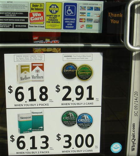
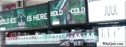
As for the above convenience store photo that I took on 09/14/20 here in Goose Creek, SC, the winner was Philip Morris USA. As for Juul getting almost equal billing with Marlboro, Altria Group (formerly Philip Morris), acquired a 35% stake in Juul for $12.8 billion on December 20, 2018.
And what's the real purpose of the yellow "We Card" sign on the store's door in the first image above and similar signs at the checkout counter? Don't you find it odd that there isn't one for alcohol?
It's teen bait. Sponsored by Philip Morris, once secret industry documents suggest that the carding sign's primary purpose is to torment neighborhood youth with the ongoing tease that tobacco use is an adult activity, a rite of passage, that it's what "real" grown-ups do.[1]
Look at the hundreds of brightly colored packs, boxes, cartons, tins, cans, bags, pouches and tubes. Collectively this power-wall oozes the impression that users can't wait to awaken each day so that they can run down to the store and try a new flavor.
You're looking at the biggest tobacco fib of all. The entire colorful facade is orchestrated to scream the lie that use is a free-choice activity, that everyone's doing it.
In your mind, strip away the rainbow of color, the fancy packaging, and the almost 700 documented tobacco flavor additives.[2] Instead, see a vast array of different doses of flavored nicotine, each engineered to penetrate tissues at varying rates of speed.
Stand store marketing on its head. Instead of being used by it, use it as motivation for staying free and keeping your money.